I’m an unashamed fan of the Olympics Opening Ceremony. Sure, it’s nice to see a display of international competition and cooperation representative of the games to come, but my favorite part is watching morning TV hosts fuck up international geography factoids and decide that a sporting event is a prime opportunity to bring up all of a country’s historical tragedies.
Beyond the Parade of Nations, the rest of the opening ceremony is usually a brief review of the host country’s history set to music and placed against a backdrop of bright colors. Usually the dancers aren’t wearing diapers, but never say never.
This year’s ceremony was a little rough, with an organizing committee both racked by internal scandal and torn between putting on a celebration and struggling to match the tone of a predominantly-unvaccinated country still dealing with the worst of the COVID-19 outbreak. A year-long delay, pandemic precautions, and staff switch-ups left us with a ceremony most commentators considered lackluster. At the very least, it lacked the pomp of the sort of show that opens with Lady Gaga emerging from a pipe like Mario.
But the show wasn’t entirely lacking. My favorite part of this year’s ceremony in Tokyo was, far and away, the pictogram tribute.
The Olympic pictograms, a set of visual depictions of sporting events included in the games, have a long history. Pictorial representations of Olympic events start showing up in the early 20th century, in Stockholm and Paris, but they’re a long way off from the designs of today’s games. They’re detailed. They have faces. White faces.
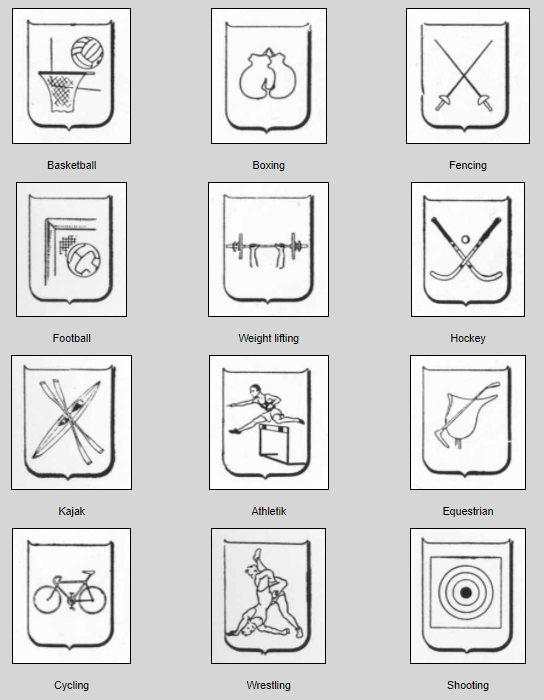
In 1936, Hitler’s Olympics turned up the dial on iconographic simplicity. They also turned up the dial on racism, so they tend to get swept to the side. Instead, folks usually credit the 1948 London Olympics for getting the ball rolling with coloring book-style shields emblazoned with athletes and sports paraphernalia.
But the history of the modern olympic pictogram really starts in 1964, in the same city that plays host to this year’s games. A team led by art director Katsumi Masaru drew a new set of simple pictures representing each of the events. The minimalist nature of the designs was inspired in part by isotype, a communicative design movement created by Austrian Otto Neurath and brought to life by him, his wife, Marie, and German artist Gerd Arntz. The goal of isotype was to create a method of communicating information visually. By standardizing a set of symbols and creating rules for their use, the Neuraths and Arntz believed that communications illustrated in isotype could be more efficiently understood by a more universal audience.

The origins of the isotype standard predated Germany’s 1936 games, but the Neuraths harbored ideas unfriendly to the Nazi regime and were forced into exile, first to the Netherlands with Arntz, and then to the United Kingdom. Arntz was unable to escape the Netherlands before Germany invaded the country, and he was conscripted into the German army in 1943. Otto Neurath died in 1945, but all three continued their development of the isotype style. Today, their work is considered to have laid the foundations for modern infographics.
Between 1912 and 1964, pictorial representations of olympic events were variable and subject to the whims of game organizers. Volleyball could one year be represented by a person, one year by a ball, and one year by both. Katsumi Masaru’s isotype-inspired pictograms changed that. The pictograms still change from year to year, but ignoring stylistic choice, they’re broadly the same; minimalist humans taking part in their sport’s most iconic activity. For stick people, they’re surprisingly expressive.
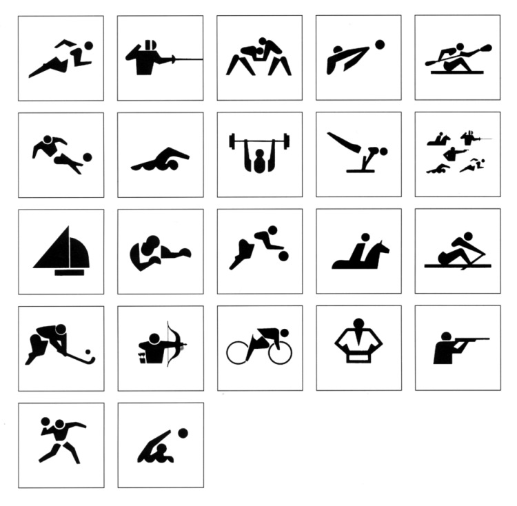
Properly designing a set of effective pictograms was important for the organizers of the 1964 games because these were the first Olympics to be held in Asia, and one of the first to take place outside of Europe altogether. The cultural similarities between the Japanese and the other attending nations were few; most Japanese people spoke only Japanese, and most international attendees didn’t speak any Japanese at all. Now more than ever, communicating information without relying on written language was vital.
That necessity is evident in the pictograms’ longevity. Even with our fancy modern ability to take in, rapidly translate, and output linguistic information, nothing beats the simplicity of a picture that universally means “basketball”. It’s like public bathroom signs — it’s easier now than ever before to translate “Where is the bathroom?” into an unfamiliar language, but the iconic stick figure duo still do a better job. More on that soon.

By the time the pictograms were unveiled for the 1964 Tokyo Olympics, preparation for the 1968 games (both winter and summer, they wouldn’t be split until 1992) was well underway. The Grenoble Winter Olympics used a set of Op Art-inspired pictograms that break my brain, and the Mexico City Summer Olympics went with their own minimalist interpretation of the events.

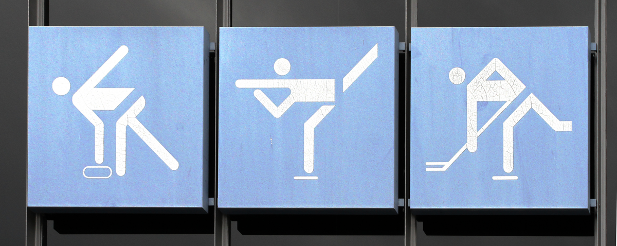
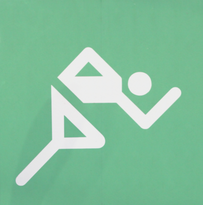
But a return to Japan in 1972 saw the Sapporo Winter Olympics reclaiming Katsumi Masaru’s design style for cold weather events. Then, in summer, the world learned that Katsumi Masaru walked so Otl Aicher could run (face-down and at a 90-degree angle).
Aicher’s history wasn’t that different from the pioneering isotypists who came before him; an anti-fascist drafted into the German military in the 1940s, Aicher tried his best to desert the army several times before finally succeeding in 1945. Post-war, he went on to co-found the Ulm School of Design in 1953. For Aicher, it was critical to understand how his fascist and authoritarian countrymen used design and to develop a uniquely antithetical approach to their strategies. Where the Nazis sometimes chose complexity, in cases like their attachment to the ridiculously-lavish German Fraktur script, Aicher embraced simplicity. Where the Nazis depicted heroic men of the Aryan race, Aicher drew non-emotive, nondescript, and universally-human figures. Of his goals for the designs, Aicher wrote “There will be no displays of nationalism and no giantism,”, emphasizing that “Sport will not be seen in relation to military discipline or as preparation for it.”.
Universality was important to Aicher. Smithsonian Design Museum curator Ellen Lupton tells Smithsonian Magazine, “He really wanted to make it like an alphabet,” and “It’s like making a font, but it’s a font of human body parts.” The article goes on to attribute to Aicher design trends that would lead the United States Department of Transportation to create a set of 50 standardized designs to serve as nonverbal communication for public places like train stations, escalators, and, yeah, public bathrooms.

Subsequent games kept the designs pioneered by Katsumi Masaru and crafted by Otl Aicher, modifying bits here and there — the Moscow 1980 pictograms are bulkier, the 1984 Los Angeles pictograms look more like marionettes, with thick lines representing limbs and thin lines equipment. The pictograms used in the 1992 French games are painted by hand and inspired by the star-shaped mascot. Spain’s 1992 summer games use more stylized brush stroke-focused shapes. They’re all uniquely effective interpretations of Katsumi Masaru and Otl Aicher’s original creations.
But the real interesting iterations start in 1994, at the first stagger-scheduled Winter Olympics held in Lillehammer, Norway. These pictograms deviate from the neat, geometric design crafted by Aicher. Their entire vibe is rudimentary and primitive; they look like cave paintings. And they’re supposed to. Designer Sarah E. Rosenbaum and the Norwegian Designgruppen ‘94 modeled their pictograms after prehistoric Norwegian rock art, in particular one image of a man on skis inscribed by an early human over 4,000 years ago.

The 1996 Atlanta Summer Olympics give the pictograms a more human shape, complete with butts. Another return to Japan in 1998 for the Nagano Winter Olympics introduces us to body positive full-figured ghosts. They’re fine.
Sydney’s 2000 games take a note from Lillehammer. To make the pictograms distinctly Australian, each makes use of a boomerang motif, some more shoehorned-in than others.
We take a break for another weird, unspecific American rendition of the pictographs for the Salt Lake City Winter Olympics in 2002, but after that we’re back on our A game in Athens. The 2004 Summer Games pictograms evoke the look and feel of ancient Greek pottery while, again, maintaining their signature simplicity.
The Beijing 2008 pictograms take their form from imagery created by bronze seals in ancient China. Pyeongchang 2018’s images use forms found in the Hangul Korean alphabet as a starting place, completing the pictorial language goals of Aicher and the Neuraths.
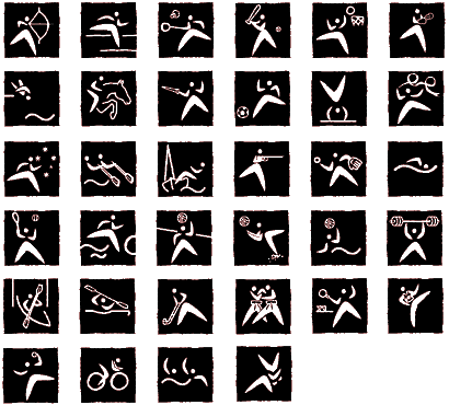
This year’s pictograms, like the choreographed performance that enshrined them and opened the show, evoke the memory of the Tokyo of 57 years ago and commemorate a family of images that set design precedents still shaping the visual face of the games more than five decades later.
Read More
- Decoding The New Olympic Pictograms by Josh Rose for Fast Company
- The History of the Olympic Pictograms: How Designers Hurdled the Language Barrier by Sarah C. Rich for Smithsonian Magazine
- The genius behind stick figure toilet signs by Jonathan Glancey for BBC Future
- Gerd Arntz web archive
- Human pictograms stole the show at the Tokyo Olympics’ Opening Ceremonies by Michael Errigo for The Washington Post
- The Olympic pictograms, a long and fascinating story from the International Olympic Committee
- This Graphic Artist’s Olympic Pictograms Changed Urban Design Forever by Livia Gershon for Smithsonian Magazine
Images
- Olympic games 1972 pictogramms olympic station 0877 a.jpg; cropped.
- This file is licensed under the Creative Commons Attribution 1.0 Generic license.
- Olympic parc munich pictogramms ice rink 0651.jpg
- This file is licensed under the Creative Commons Attribution 1.0 Generic license.