Minnesota’s state flag is bad. It’s simultaneously unremarkable and cluttered, ridiculously complex and altogether unrecognizable. It’s an unwanted china plate on a blue tablecloth, a design well-known to all the flagbois out there as the “seal on a bedsheet”, a design schema shared by 25 state flags all proudly flown by no one. Above all, the current flag is boring, and it could be so much more.
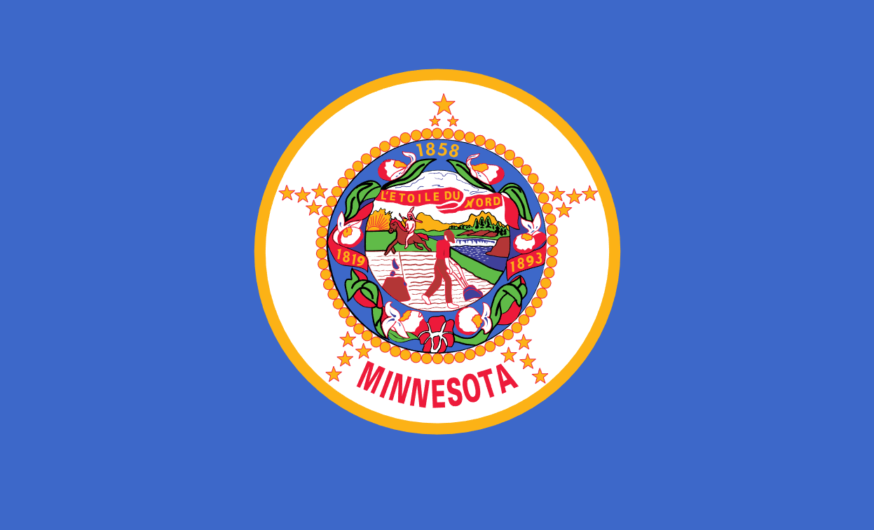
Some people disagree with me on this. The Minnesota state flag, they might argue, is a near-perfect encapsulation of the state’s history and culture. There’s a farmer in the middle, who represents Minnesota’s long standing agricultural history. There’s a Native American, too, naked on a horse, as they’ve been known to do. The farmer is even looking at him, as though to say “I accept you.” and not “The Dakota War was 31 years ago, get off my land.” There’s a picturesque Minnesota backdrop, complete with trees, water, and the sun, all of which are well known to residents of this state alone. Above the scene, the state’s motto, “L’etoile du Nord” rests on a clear sky, lest we forget it.
All around the flag’s central picture are a wreath of lady slippers, the state’s flower, and a trio of dates: 1819, commemorating the establishment of Fort Snelling, 1858, the year Minnesota was inaugurated as a state, and 1893, the year the flag was adopted, which seems a tiny bit presumptuous on the artist’s part. Around that wonderful wreath of history, we’ve got a circle made out of circles at the center of a sort of star made out of 19 stars. The nineteen stars are an obvious nod to the fact that Minnesota was the nineteenth state… after the first thirteen states, of course. Thirty-two stars would be absurd, better keep it to the more easily stomachable nineteen. Finally, between the two bottom arms of the mighty morphin’ mega star, the word “MINNESOTA” in bold red sans-serif font, to remind us what state we’re looking at after the barrage of information sends us into a coma.
Wait, shit. I was supposed to be defending the flag. My bad. Listen, it’s good, but I think we could turn it up on the symbolism and direct Minnesota references. There’s still some Minnesota missing from the flag. Here, let me try to fix it up a little:
“But Ben”, you might argue, “Design is subjective, and the Minnesota state flag has worked for over a hundred years. Who are you to tell us any different?” To which I sneer at your straw form from across my soyfield, much as an 1893 farmer might stare at a Native American as his horse purposefully tramples my newly-planted crops. Like every naturally beautiful art without explanation, nerds everywhere have taken it upon themselves to deconstruct the beauty into an easily-digestible format. For today’s topic, the nerds in question are the brave men and women of the North American Vexillological Association. They’ve boiled the components of good flag design down to five key principles:
- Keep it simple (The flag should be so simple that a child can draw it from memory)
- Use meaningful symbolism
- Use 2 or 3 basic colors
- No lettering or seals
- Be distinctive or be related
Using this list of principles as our guide, let’s give this mess of a flag a proper investigation.
First, Keep it Simple. A flag should be so simple that a child can draw it from memory. You may see an immediate issue with the current state flag, but I think this one is perfect. Minnesota was built on the back of strong, protestant work ethic, something this flag is an impeccable representation of. If the children of the North Star state can’t draw this beacon of state pride from memory, are they really trying hard enough? C’mon, future gophers. Try harder.
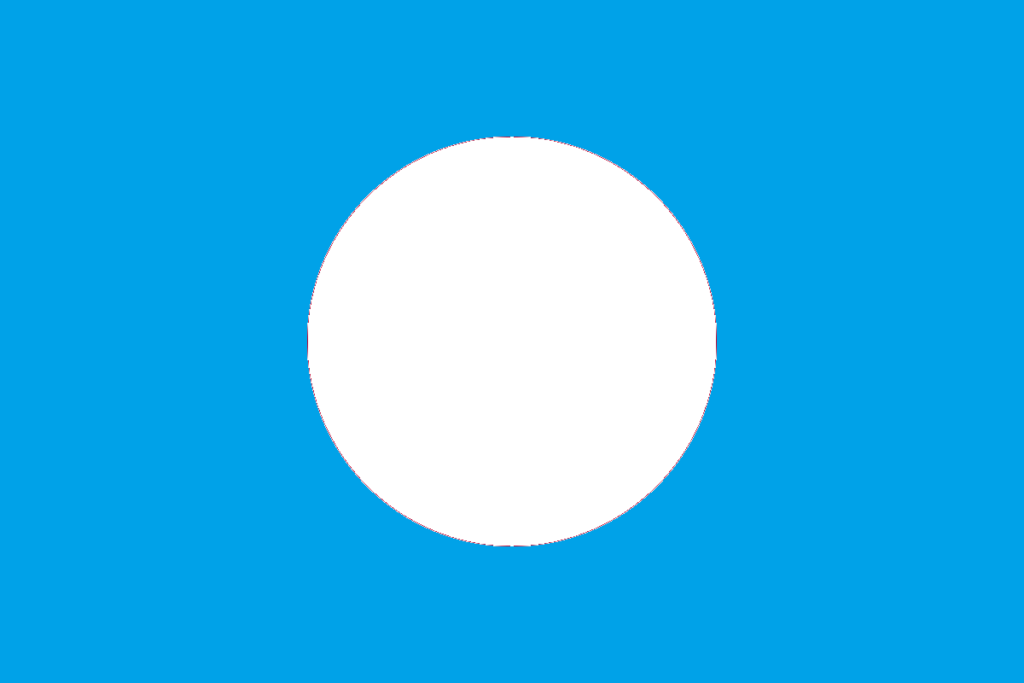
I hold our children to a high standard. I have to, to keep myself from panicking about what living in a post-boomer world might mean for all of us. But viewing the situation from behind my Minnesotan veil and through the eyes of a born South Dakotan, I have to recognize that eight-year-old me would have drawn a white circle on a blue field, which would better represent the United Nations Mandatory Government of Japan that will unfortunately be necessary after the mecha wars drive that country into ruin. I just hope for Japan’s sake that they have a steady supply of children smart enough to draw the Minnesota state flag.
Second, Use Meaningful Symbolism. Well, shit, you got me there, don’t you? The guidelines don’t even lay out a framework for how much symbolism to use, so let’s call this one a loophole.
Third, Use 2 or 3 Basic Colors. In a quest to better make my point, I set out to count all the colors included on the current flag, but halfway through, a historically bad winter wiped out my soybean crop and froze my eyes shut. Better luck next time. Anyway, if the Minnesotans of old would have eliminated a few dozen of those colors in the first round, maybe the north shore wouldn’t have to settle for out-of-state tofu this year.
Fourth, No Lettering or Seals. Lmao. If the flag’s designers had gotten wind of this rule before they got the legislature’s stamp of approval, we’d be left with an empty blue background. Hey, it worked for Libya for 44 years. Why not us?
Finally, Be Distinctive or Be Related: I looked through all of the flags on Earth, and it turns out Minnesota’s is truly distinctive in that no other flag depicts a mid-plow white farmer looking at an ahorse Native American beside a river, beneath the Minnesota state motto, and surrounded by, again, the mighty morphin’ mega star straddling the word MINNESOTA. If that counts for distinctive, we’re great. Additionally, the flag is related to other state flags in that it looks exactly like 50% of them from a distance.
Realistically, the flag doesn’t come close to passing either of these principles. One rule-of-thumb passed down from the vexillological gods waving in the wind above is that a good flag should be recognizable from far enough away that it appears smaller than your thumb. If you can pick the Minnesota state flag out of a lineup of other state flags from two hundred feet out, good for you. The Japanese will need your help in cleaning up after the mecha shogun.
I’ve done it. The Minnesota state flag has been as thoroughly destroyed as all of my enemies on Reddit. So where does that put us now? If the current flag is bad, what do we replace it with? To that question, I don’t have a definitive answer, because my talent is in destroying things, not building them. It’s how I convinced a postwar country with a booming technology economy to name me mecha shogun. Still, we have to pick something, lest we be left with Grandma’s pseudo-racist china plate on a blue tablecloth.
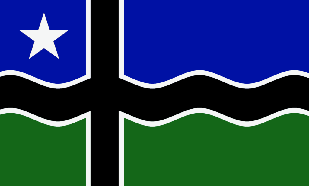
Beneath the shroud of current-flag supremacy, there are already a number of contenders to the crown. Of these, the best-known may be the North Star flag, designed in 1989 by Reverend William Becker and Lee Harold.
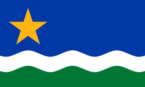
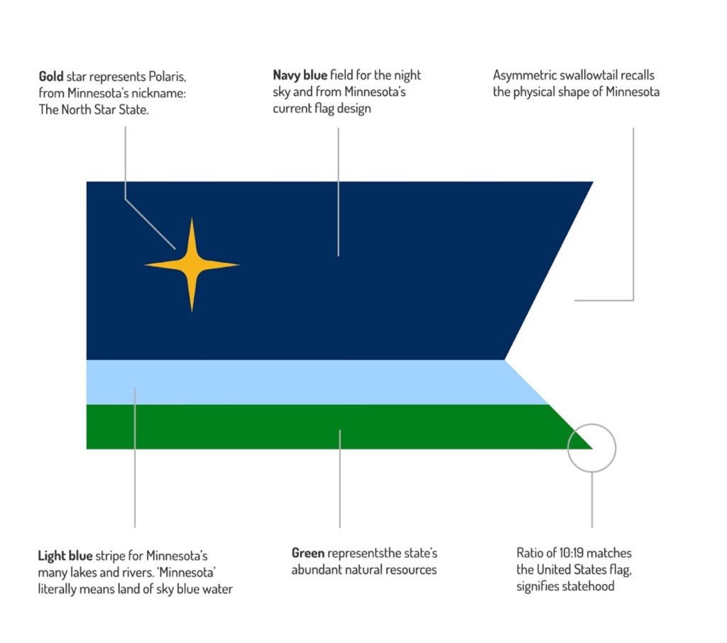
It’s not a bad flag. The North Star is plainly present in the banner’s top left corner in front of a blue background representing the state’s lakes and water resources. Beneath the blue, two wavy bands of white and green represent winter, the state’s farms and woodlands, and, again, water. The flag was the winner of a contest held by the Pioneer Press and independently endorsed by the Star Tribune. The flag has become well-known to MN United Fans, who fly it proudly and openly at and around Allianz Field. Part of me feels a little bit of discomfort at the color choice, particularly something about the blue and gold, but who cares what I think? Right now, the North Star flag is the undisputed frontrunner.
Still, it’s not alone. A 2017 change.org petition aimed at forcing the state to adopt a new flag introduced several options produced primarily by Reddit’s /r/vexillology community. Here are some of the options put forward:
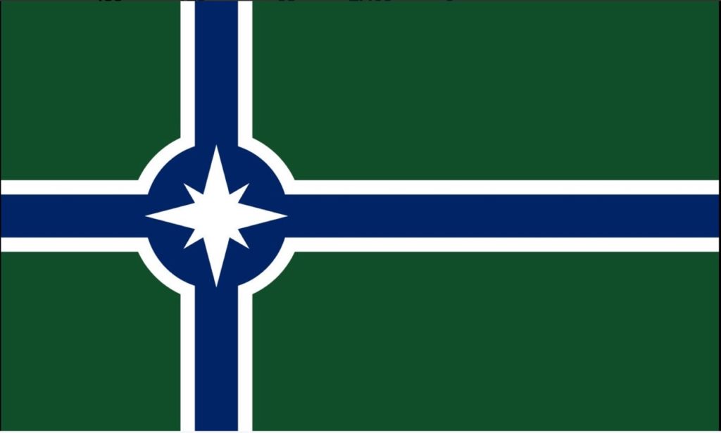
I don’t mind this one. A little complex, maybe, but the North Star design is relatively simple, with an arguable necessary winter twist.
Most of the suggestions focused pretty heavily on the state’s history of Nordic settlement. Admittedly, when I first engrossed myself in the argument that Minnesota needed a new flag, I felt the solution was simple: a Nordic cross (a la Norway, Sweden, Iceland, etc.), but in hues of the North Star state. In retrospect, I hold the idea in lower esteem now. Minnesota has a strong history of Nordic settlement and community-building, but also a significant history of German, Irish, Hmong, and Somali settlement. And that’s all ignoring the Native American history that dominates the pre-1819 era. At least the current flag acknowledges that, in all its naked glory.
Anyway, I’m not going to offer a blanket statement that all Minnesota-themed Nordic crosses are bad, but Reddit could’ve done a better job of making them look less… North Star Nazi?
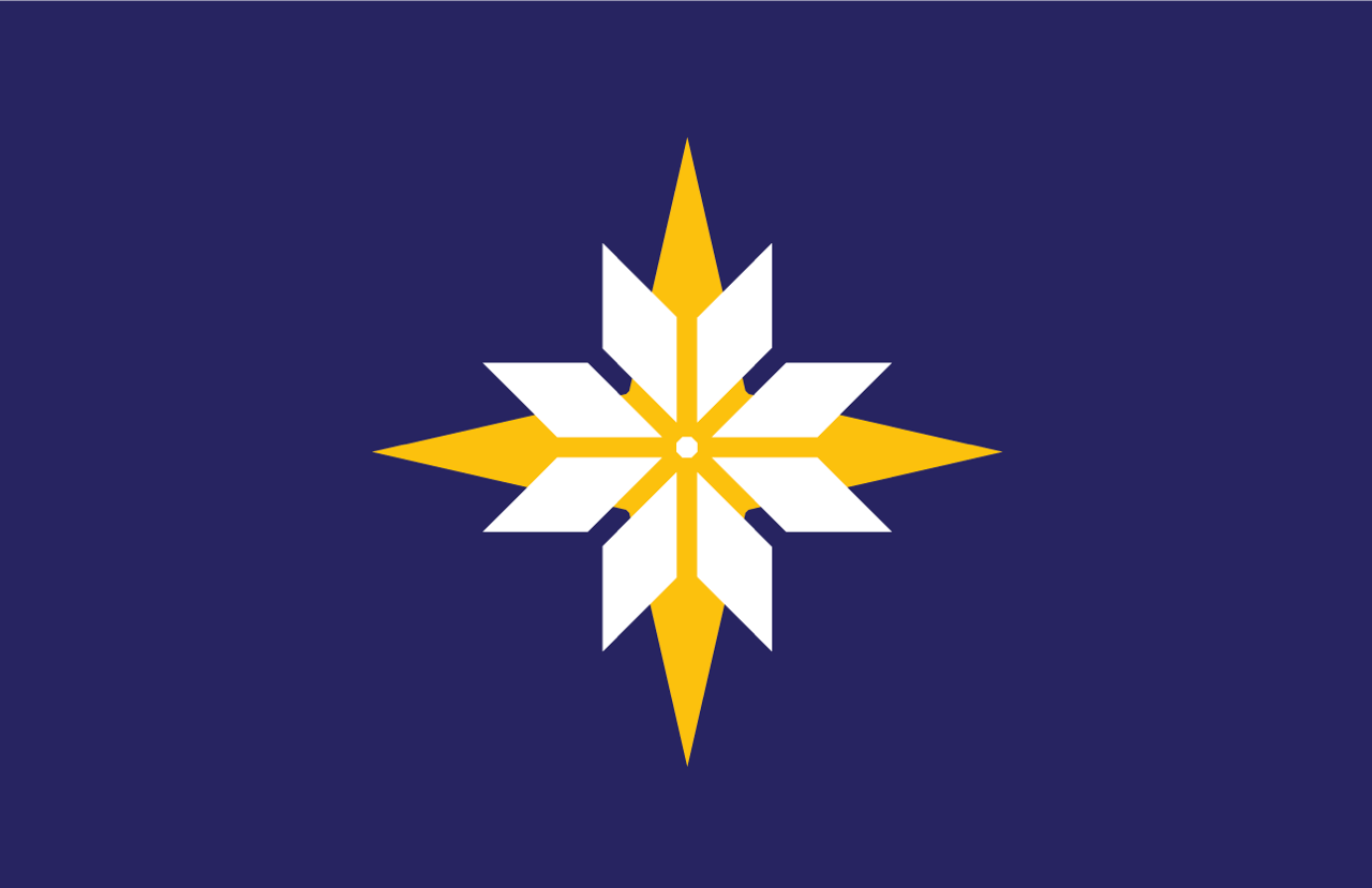
Still, the petition forced some previously-unknown contenders into the limelight (the limelight being all 400 signers and everyone who read the Citypages article about it). Take this one, for example:
I don’t love the design of the star, and maybe it’s a little corny (which is more Iowa’s thing, we’re all about soy here), but that thing they’re calling the ‘asymmetric swallowtail’? I love that shit.
So what’s my pick? Yeah, I still don’t know. I woke up late today, and that’s a lot of pressure to put on someone who wasn’t born here. Maybe this is something best left up to statewide discussion and then put to a vote. New Zealand did the same thing in 2015 and 2016, culminating in a vote where the nation’s people decided to… keep their current flag and not adopt a new one. Maybe New Zealand is a bad example, but compared to the leftover hotdish on a blue platter we have so far, the kiwi banner isn’t really that bad. Either way, it’s worth a shot, right? What’s the worst that can happen? Don’t challenge me on that. There’s always the possibility we go the way of Provo, Utah.
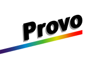

…a city that recently adopted a new, comparatively wonderful flag. And, look, while being “the new Provo” might not be a label Minnesota aspires to, it’s gotta be better than being “the current Milwaulkee”.
